Home » Design » How to Make an Event Poster Attractive and Effective
2.17 AM How to Make an Event Poster Attractive and Effective |
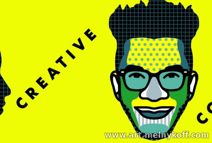
How to Make an Event Poster Attractive and Effective Don't know how to make a poster? Here are some simple poster design examples that you can use to create your own cool poster to promote your upcoming project or event. So, you are finally ready to hold an art exhibition to present your work, photographs, to the world. But how to attract the public to your event? A good poster, an announcement poster is a good presentation of the beginning of an advertising campaign. If you've never made your own poster before, we've put together some easy tips on how to make your poster stand out and ensure your next event is filled with potential clients! What to put on a poster A bright, informative poster attracts the eye. Start by listing all the necessary information on the poster, such as event name, location, date and time. There may be more you'd like to add, but keep it simple so you don't overwhelm the poster with visuals. Posters with too much text and images are less effective than posters with less text and images. Consider promoting a two-week art exhibition at a local gallery. For a short-term event, you don't need to include a lot of information to get your point across. Don't add extraneous information, such as thumbnails of artwork and artist biographies. The goal here is simply to get people interested and to attend your event. You will have many opportunities to introduce them once they attend your event, and you can also create flyers or catalogs. Write an attention-grabbing headline The title of your poster should grab people's attention. This should not only grab their attention, but also make them stop and read the information you are trying to share and convey to them. While you could use a simple descriptive title such as “photo exhibit” or “art exhibit,” it is probably in your best interest to provide a little more context. Try to summarize the essence of your event in a few short, punchy words that will let people know what to expect if they decide to come to your event. You can get creative or keep it simple as long as you make sure your headline is not misleading or confusing to customers. Create a visual hierarchy To make a good poster, you need to know the visual hierarchy. Visual hierarchy is a way of displaying information based on its role in the intended design. It determines the size and position of the text. The flow of information and visual hierarchy determine what your viewer pays attention to first. You've already collected all the information you need for your poster, such as event information. The next step is to prioritize this data. If your poster design doesn't have much text, a bold image or icon will suffice. If the design is heavily text-based, then the text should be the focus. You will need a large title and short text for this design. This text hierarchy consists of three main elements: the headline, the subhead (a statement or piece of information that supports or reinforces the headline), and the body text (the remaining text content). The headline should be the largest element, followed by medium-sized subheadings and body text in the smallest font. There should only be one heading, but you can have as many subheadings or body text as you like. Keep it simple and give the viewer plenty of room for imagination. Sketch your design As an artist, you probably already know the value of creating a detailed rough sketch before you begin working on the final draft. The process of creating your own poster is no different. Once you understand what information you are including, it's time to come up with a concept for your poster design. Think about how you want to present your event to your audience and what you want to tell them to keep them interested. You can sketch out a few different designs to get an idea of what works and what doesn't. If you prefer to create your poster digitally, consider wireframing your design before jumping into Photoshop or your preferred program. Need some inspiration? There are many innovative poster designs that use dramatic black and white minimalism, creative photo placement, and retro styling to attract audiences. Browse the list of design competition winners or browse great design portfolios online to learn more about how to make a great poster. Feel free to download a few poster templates to get started, especially if you're having trouble visualizing your poster layout. Don't be afraid to try something new and push boundaries to grab the viewer's attention. Choose a color palette The color palette you choose can dramatically change the look of your poster and subtly influence viewers. Colors can completely change the tone of your poster and how your audience perceives it. It's tempting to use the brightest and boldest colors to make your poster stand out. However, bold colors are not suitable for every poster, so consider the purpose of the poster. A poster for a concert band might look great in black and white, but a poster for a vegan food market looks better in calmer, more down-to-earth colors. Another trendy color scheme these days? Earth tones. If you're not sure what colors to use for your project, look to design trends for inspiration. You can have fun experimenting with new color combinations and seeing how they affect your design. Just try it and see! Check your typography Whether your poster design is all text or more image-based, you will need to include some text, and that means choosing the right fonts to reinforce your poster's concept. Using smart typography options can be a very effective method of creating a minimalist design that still stands out and makes a lasting impression. Here are some tips and ideas to help you choose the perfect font for your poster design. Check for readability Can the title text on your poster be easily read from a distance? Can the average person read words easily without the font style bothering them? When communicating details about an event through a poster design, legibility of the text is extremely important. Choose your fonts While you don't have to use one or two of the same fonts throughout your entire poster design, you do want to make sure that all the fonts work together and match each other (and your poster design concept) in terms of mood and aesthetics. Consider the context Use fonts that suit your design depending on the content you are presenting. Just because you like a certain font doesn't mean it's a good fit for your poster design. For example, an event that raises funds for a medical treatment will require a completely different set of fonts than what you might use on a poster for a concert for a hard metal band. It's up to you how many different fonts to use on your poster, but keep in mind that the more fonts you use, the more confusing your poster can become. Don't be afraid to experiment Do you have a short, catchy title? If so, you may have room to have a little fun with your font choice. You can try using a decorative or other unusual font to really grab your viewers' attention. However, always prioritize the purpose of your poster's design rather than choosing a font just because you like the way it looks. A graffiti-style font is perfect for an urban-themed event, but not for a corporate event. These are just a few of the things you should be aware of when it comes to choosing fonts for your poster design. There are many other elements that influence the selection or design of a font for writing, such as kerning (the distance between letters), leading spaces (the distance between two adjacent lines), font size, weight (light, regular and bold), line height (the distance between two lines of text) and case (upper, lower, small caps) when placing typography for a poster design. How to Make a Cool Poster Design Using Your Images Earlier we talked about what things to place on the poster and what to exclude so that it doesn’t feel crowded. Now we'll look at how you can create a hero image that complements the text elements of your poster design. There are many different methods you can take when it comes to the images you include in your poster. You can use a hand-drawn illustration, a photo you took, a stock image, a collage, a digital painting, and more. By adding visual elements as well as text, you can bring your poster design to life. Remember the importance of the quality and composition of the images you choose. Here are some tips for choosing the best images for your poster design. Check image size and resolution The last thing you want is to spend a ton of time and effort creating the perfect poster design, then print them out only to find that your images come out blurry. Figure out what size you want your poster to be, and then calculate the image size you need for high-resolution printing. A good rule of thumb for printing images is to make sure your image resolution is at least 300 DPI (dots per inch) to avoid a pixelated poster. Match your color mode to your printer Find out if your printer uses CMYK or RGB as its color mode. If you design your poster using CMYK but print it using RGB (or vice versa), the color palette you spent so much time and care choosing will likely look very different than you imagined. It's always a good idea to figure out your color mode before you start designing your poster, otherwise you may have to go back and manually adjust the colors before printing. If you use an image you created, feel free to use it. However, if you are using someone else's image, even if you got it from a stock photography site, you will need to read the copyright information carefully to determine whether you are allowed to use that image in your poster design. Use free space Just because you have space on a poster doesn't mean you have to include additional information or images. Instead, use negative space to draw the viewer's attention to what you include in your poster design. This can help you make an impression without overwhelming the viewer with too much visual information. Consider experimenting with this fundamental aspect of design! Use simple shapes instead of images Some designs use geometric shapes to create visual flow and engage the viewer. These types of designs can be fun and eye-catching, and they can also help push you out of your comfort zone when creating posters. If you're wondering how to make a good poster that effectively targets your audience, you need to start by understanding who your audience is. Your poster design will likely be completely different when creating a poster for a farmers market than for a nightclub event because the two events attract different target audiences. Once you've figured out who your dream client is, every element of your poster design should be carefully chosen with that client in mind. A poster that doesn't speak to your audience should be redesigned so that it is more likely to attract the attention of the people it is designed for. If you're looking for examples of what designs work for different types of events and audiences, take a look at posters in your area. Pay attention to what type of event is being advertised, who the audience will be, and what design options are effective (or not so effective) for the target audience. Include a good call to action Your call to action is designed to get the person who looks at your poster to act on the information you provide. To inspire action, your message needs to be the visible, if not the most eye-catching part of your entire poster design. This could be a colored square with a QR code inviting them to RSVP to an online event, or it could be something as simple as an offer asking them to show up at a certain location at a certain time. Your poster design should direct the viewer's eye to your call to action and encourage them to do what it says. Now that you know all about how to create good posters that will grab your audience's attention, it's time to start designing. Don't forget to share your poster online as well as on your art portfolio website . We wish you a sold out event, all thanks to your amazing poster design!
|
|
|
| Total comments: 0 | |