Home » About design » Creation and development of a banner for your business
5.51 AM Creation and development of a banner for your business | |
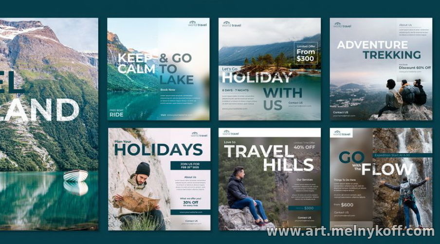
Creation and development of a banner for your business When it comes to designing and printing a banner for your business (or on behalf of a client), you need to consider many things. Even if you are relatively experienced in other forms of print design (like designing stickers or flyers, etc.), there are several aspects of great banner design that many designers tend to neglect, and they are often critical to the success of your banner. Unlike many other printed marketing materials, banners need to be readable and visible from a distance, and therefore there are certain design elements that need to be emphasized to ensure that this is the case (we'll talk about these elements in more detail). To help you solve your banner design problems , our graphic design team has used their knowledge to help create this guide detailing the entire process of designing (and printing) banners. Consider placing your banner The first thing you should think about before making any other design decisions is the intended placement of your banner. While it may seem like we're working backwards to some extent, the intended placement of your banner will likely influence the choice of color scheme (or even overall design) used for your banner. Ideally, your banner's color scheme should strongly contrast with its placement. So, for example, if you are planning to place your banner on a yellow/orange brick wall, it may be wise to ensure that the background of your banner is not the same color. You can see that the design above doesn't stand out much from the background, and you can imagine that because of this it won't attract much attention from a distance. Another example of this error is seen in the Blueprint banner. You can see that the banner mainly uses blue and white colors. This is great as these colors are very contrasting on their own, but you will notice that the banner is placed on a blue and white wall. Although the shade of blue is slightly different, it might have stood out more if a different color had been used. It is likely that the intended placement of these banners was not taken into account before the design process began. Choose bright and contrasting colors Following on from the previous point, it is also a good idea to ensure that your banner is designed using both bright and contrasting colors. If you look at the banner design from Denver Water, you'll start to see what we mean. Denver created this banner to inform Denver residents about a rather boring and uninteresting issue; hose ban. With an issue as boring as this, it's likely that most people won't pay much attention to your banner, so you need to use all the tricks to make sure it stands out. Obviously there are other design elements at play here (like the clever use of the hose that holds the banner), but you'll also notice that the banner uses a very vibrant color scheme (mostly orange). Orange simply attracts attention and, more importantly, does a great job of attracting attention from a distance. It also contrasts greatly with the natural blue color of the sky. You will also notice that white is used for the text on the banner, which contrasts strongly with the orange background. This, combined with large, bold font (more on text in the next point), ensures that the message is clear and stands out from a distance. You can see some more examples of the bright, contrasting colors used in the banners above. These banners from Eduloan use bright colors in different shades to make them stand out. Although in this case the text uses the same bright color as the banner graphic, a white background is used to make the text high-contrast and stand out. Using bright and contrasting colors is almost always a great idea when it comes to banner design. Use large text One thing you need to remember about banners (which is different from many other marketing materials such as flyers and leaflets) is that in most cases the goal is to attract attention from a distance. Because of this, you need to ensure that any content written on your banner is written in large, readable text, as without this it is unlikely that your banner will be clear to anyone more than a few meters away. For example, take a look at the Under New Management banner. You can see that large text is used here so that it can be read from a distance. Often the purpose of such banners is to attract the attention of passersby (often in cars) and communicate specific important information to them. In the case of a "Under New Management" sign, it is very likely that you will want to attract customers who will want to try out your establishment and see what changes have been made, so it is important that the banner is readable from a distance. If you look at the Mostly Mutts banner, you'll see how important large text is when it comes to your design. While the Mostly Mutts logo text is relatively large (though not very large), the rest of the text on the banner is quite small. If you were to see the banner from afar (perhaps while driving by), it is unlikely that you would be able to read any other words on the banner. This may leave you in the dark about what Mostly Mutts actually does. Choose a bold + readable font However, it's not just the size of your text that matters; you also need to think about the font you are using as well as the weight of that font. For example, take a look at the image above with a banner about retail space available for rent. You will notice that the main message (that the store space is available) is written in large font. However, you will also notice that the font used is easy to read even from a distance. One of the reasons for this is that it is printed in a large, bold font and also that the font style is quite simplistic. There are many different fonts available and it can be tempting to choose something overly bright, but when it comes to banners, readability is always something to consider. As a general rule, bold sans serif fonts are easier to read than serif fonts, but this rule is not set in stone. For example, some serif fonts, such as Times New Roman, can be read well even from a distance, which is why such fonts are used in professional media such as newspapers. You just need to avoid the fonts used in the School Olympics banner. Although it is printed in a fairly large/bold font, the font itself is very inconsistent and probably isn't very readable from a distance. Keep the text simple
Another extremely important thing to keep in mind when designing a banner is to keep the text/message as simple as possible. You'll notice that all the banners we've shown in this guide have been quite simplistic in terms of actual text content, as most of them contain no more than a few words. The reason is simple; banners should convey your message as quickly as possible, since most of the target audience simply does not have time to read paragraphs of text (most of them are walking or driving past). If you look at SlideCandy's banner, you'll see how they managed to convey their desired message while keeping their copy simple and straightforward. The banner simply states the name of the company (SlideCandy) and what they do (delivery of ski rentals). This text can be read and understood in seconds, even from a distance. If you compare this to the Clear Glass banner above, you'll start to see how too much text can actually dilute your message and make your banner unreadable (especially from a distance). You can see that this banner is overloaded with text. It tells you the company name, their phone number, a list of everything they do, their website address, before/after text, and even their address. A lot of this copy is completely pointless and just makes the banner design look cluttered and unprofessional. When designing your banner, be sure to think about what is needed and what is not. Try to remove anything unnecessary and get your message across in the simplest possible way. For example, if you are advertising your cleaning company, the text “Hire a cleaner for 1000 hryvnia per hour” will probably be more effective than “Are you too busy to clean? Try our cleaning services for only 1000 hryvnia per hour.” Include relevant information Following on from our previous point about removing anything unnecessary, it is also important that you apply the same idea to the information contained in your banner design. You must ensure that you include relevant information, and only relevant information. To know what to include, you need to think about what exactly you want to achieve with your banner. Do you just want to increase brand awareness? Or do you want to inform viewers about a certain product/service or aspect of your business? Is there a specific action you want them to take? If you are simply looking to increase brand awareness with your banner, you may not need anything more than your company name and/or logo. A good example of this type of banner is the McDonalds design. You can see that they haven't included anything other than their logo, tagline, and graphics of their iconic products (like the Big Mac, French fries, and drink).
However, as a rule, most banners are created to inform viewers about something more specific. This could be a sale, an offer, a product launch, or even an event. You need to think carefully about what information to include. If you look at the banner above, you will see that it is clearly an advertisement for laptop repair and upgrade services. It includes only the most relevant information that is straight forward. It simply tells you what the company does, how much it costs, and what number to call. It also lets potential customers know about the unique interest-free offer associated with the product and service it is promoting. When you're designing your banner, you really need to keep the goal in mind and only include information that can help bring results. For example, don't include your business address unless it's needed; it just clutters the design. Always use a call to action In addition to including relevant information in your banner, you should almost always also include a call to action (unless you're creating a banner for the sole purpose of increasing brand awareness, this may not be a good idea). Essentially, your call to action encourages the viewer to take a specific action. This could be something as simple as visiting your website or calling you. If you look at the banner from Stamford Properties, you may already be able to see the call to action. You can see that the banner says “Call us today for a free quote” followed by two phone numbers. It is essentially a call to action because it tells the viewer to take a specific action (such as calling a company to get a free quote). While it's generally recommended to include a call to action in your banner design to maximize your return on investment, sometimes it can be smart to make it a little more subtle. For example, in the above Nottingham Science Park banner, the website URL at the bottom of the banner actually acts as a call to action. While the banner doesn't specifically say to visit this URL for more information, that's exactly what a URL implies in the modern world we live in. Likewise, including a phone number or email address will mean that you must call or email to find out more information. It is recommended that your call to action is also a fairly prominent part of your banner design (so use large bold text, readable font, contrasting colors, etc.). Use high quality graphics Since the goal of most PVC banners is to attract attention (often from afar), you need to do everything possible to attract the attention of passersby to your banner. We've already mentioned color, typography, and size, but another "trick" is to include high-quality graphics. Graphics (or images) can act as a focal point for your banner and therefore often entice passersby to glance in your direction. The above banner design from Monsoon Valley shows a good example of how high quality graphics can be used to great effect in a banner design. Without the image of wine bottles in the center, this banner would be quite dull and boring and probably wouldn't attract much attention. It may seem like adding an image doesn't make a big difference, but if you take a quick look at the banner, you'll probably notice that this is the area that your eyes are drawn to. High-quality graphics not only help grab attention, but they can also help reinforce your message and/or convey emotion without the need for additional text. You can see a good example of this in the banner from Drum Housing Association. It is clear that the purpose of the banner is to promote their affordable rental housing. The banner plays on the fact that many people looking for an affordable home will be couples. Therefore, to the left of the banner, high-quality graphics of a happy young couple were used. This reflects the idea that company can bring you happiness (which is hard to put into words). We recommend that you use quality graphics in your banner design, but don't overdo it. If you use too many graphics, the design will look cluttered and unprofessional, so try to stick to just one or two (always go for quality over quantity). Use hierarchy in your design An extremely important part of successful banner design is the use of hierarchy. Essentially, hierarchy means that the most important points/information should be the most prominent in your design, with less important points fading into the background. But how to create a hierarchy? You can use text size, color, font weight, and many other attributes to draw more or less attention to certain aspects of your banner design. Take a look at this banner from Kiddi Caru, for example. You can see that the large text size and yellow color have been used for the most important part of the message (that seats are now available). Two slightly less important items (phone number and email address) are written in a smaller font size and also in a duller color. The least important part of the banner (website address) is written in the smallest font and located in the corner of the banner. It's unlikely that people will notice the website URL when they first look at this banner; their eyes will be drawn to the most visible parts of the design. The banner also uses hierarchy in its design, using both font weight (regular/bold) and text size. It's a pretty subtle hierarchy in this case, but it still exists. Using hierarchy in this way will ensure that you draw people's attention to your most important point and instantly convey the message your banner is intended to convey. Don't forget about your brand Finally, it's important to remember that while all the points mentioned in this guide will ultimately help your banner stand out and get attention, you should also keep your brand in mind throughout the design process. Just because a certain color may be the brightest, it doesn't necessarily mean it should be used in your banner design if it doesn't fit with your existing brand. If you look at the Apple banner, you will see that the design is quite simple and does not use any bright colors. It doesn't matter because the banner still stands out and is instantly recognizable as an Apple banner. You should aim for the same with your banner. How to print your banner Now that we've told you about the design process, we want to highlight a few things you need to think about when it comes to the printing process. Set the resolution correctly Since most banners are relatively large in size, setting up your file correctly during the design process can be a headache. In particular, setting the correct resolution is something that many designers struggle with. Most printing companies require a full-size banner to have a resolution of 150 dpi. However, if your banner is several meters long, it can be a little difficult to work with such a large project during the design process. For this reason, we recommend designing and saving the file to be a quarter of its intended size. If you do this, you will need to be sure to increase the resolution to 600 dpi (four times the resolution of a full-size banner). This will also help keep the file size as small as possible, which is often useful when sending a file back and forth to a print shop. You can adjust the resolution of your file when creating a new file in Adobe Photoshop and Illustrator, as you can see in the image above. You should also keep in mind that you will need to smooth the file in Photoshop or outline the fonts in Illustrator before sending it to the printer. Use Adobe Illustrator if possible If you don't plan to use any graphics in your banner design, Adobe Illustrator will probably be the best application to use, as your project will be set up as a vector project by default. This means your file will have no resolution, and you can theoretically stretch it to any size without losing image quality. However, if you include raster graphics in your design, you should be aware that they will usually not be vector graphics (unless converted) and therefore they will lose quality if you stretch your design. Convert to CMYK As with any design intended for print, you will need to either work in CMYK or convert your design to CMYK at the end of the design process. This is because most modern printing methods use the CMYK printing process rather than RGB. Most popular design applications (such as Adobe Photoshop) set your project to RGB by default. If you don't convert to CMYK, you may end up with unexpected results when you receive your banner. If you want to learn more about the differences between CMYK and RGB printing, check out our guide. Conclusion It may seem like a lot to understand at first, but we can assure you that if you follow the tips written in this guide, your banner will turn out very well . You just need to make sure that you choose the right printing company for the job. It is important to understand that not every banner will address all the points mentioned above; the purpose of this post is to serve as a guide, not a solid foundation for the perfect banner. As with any design, you must keep your own needs in mind and design your banner accordingly. For example, if you feel that using an obvious call to action in your banner design doesn't align with your existing brand values, you don't need to do it (though we recommend including at least a subtle call to action for maximum impact).
| |
|
| |
| Total comments: 0 | |